


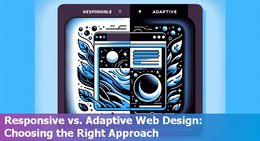
Responsive vs. Adaptive Web Design: What Developers Need to Know
Last Updated: June 5th 2024
Too Long; Didn't Read:
Responsive vs. Adaptive Web Design: HTML structures the page, CSS enhances visuals, and JavaScript adds interactivity. Learn why responsive design is favored for its simplicity, while adaptive design offers custom experiences for different devices. Understand the best practices for implementing responsive and adaptive design and cater to user needs effectively.
If you're trying to get into web dev, you gotta understand the basics. We're talking HTML, CSS, and JavaScript – the holy trinity of web coding. According to FreeCodeCamp, these are the building blocks you need to get your website poppin'.
- HTML: This is where you structure your webpage, like the frame of a house. HTML lays out the content and the overall skeleton.
- CSS: Think of this as the interior design of your website. CSS is all about making your site look fresh and pleasing to the eye.
- JavaScript: This is what adds the cool, interactive features to your website. JavaScript makes your site dynamic and responsive to user actions.
If you want your website to look dope on all devices, you need to master these skills.
This blog is gonna dive into responsive and adaptive web design, so you can build sites that look great on any screen, from smartphones to desktop monitors. We'll compare the two approaches and give you the inside scoop on when to use each one, based on insights from Nucamp's articles like Responsive Web Design 101 and Web Development Basics.
Table of Contents
- What is Responsive Web Design
- What is Adaptive Web Design
- Responsive vs. Adaptive: A Comparative Study
- Best Practices for Implementing Responsive and Adaptive Web Design
- Conclusion
- Frequently Asked Questions
Learn the fundamental UX design principles that every web developer must know for creating compelling web experiences.
What is Responsive Web Design
(Up)Responsive Web Design (RWD) is the real deal when it comes to modern web development. It's all about making sure your website looks bomb and works like a charm, no matter what device you're using - smartphone, tablet, or desktop.
The key players here are fluid grids, flexible images, and media queries.
Fluid grids let the elements on your page resize smoothly, like they're made of stretchy material. Flexible images keep their proportions on point, no matter how big or small the screen is.
And media queries? They're like the cool kids at the party, telling your website how to dress for the occasion - whether it's a tiny phone screen or a massive desktop monitor.
Here's the kicker - nearly 86% of the world is glued to their smartphones these days.
People want a smooth experience, whether they're browsing on a 4-inch screen or a 27-inch beast. RWD is the way to go if you want to keep your users happy, make your site accessible to everyone, and boost your SEO game.
Big players like Dropbox and GitHub are nailing this RWD thing, with websites that look sleek and user-friendly no matter what device you're rocking.
61% of mobile users are likely to ditch a site that's not mobile-friendly. So, if you want to stay relevant and ahead of the curve, learning responsive design skills is a no-brainer.
As Brad Frost said, "The best responsive websites fluidly adapt to the medium that displays them." It's all about rolling with the punches and keeping up with the latest tech trends.
RWD is the way to go if you want your website to look fresh and function smoothly, no matter what the future holds.
What is Adaptive Web Design
(Up)Adaptive Web Design (AWD) is a way for web devs to create different versions of a website tailored to look on all sorts of devices. Instead of a one-size-fits-all approach, AWD serves up the right layout based on your device, courtesy of some server-side magic that detects what you're rocking.
Wikipedia breaks it down – AWD dishes out custom layouts for six standard screen widths, so whether you're on a tiny phone or a massive desktop, you get a layout that's on point.
- Distinct Fixed Layouts: They craft specific designs for common screen sizes like 320, 480, 760, 960, 1200, and 1600 pixels, with a smooth viewing experience no matter your device.
- Server-Side Processing: The server checks out your device's specs and serves up the perfect webpage version, optimizing performance and speeding up load times.
- Strategic Customization: AWD dishes out content tailored for your device, which can lead to better performance and lower data costs, since you only get what you need. This approach is for revamping existing sites, as UXPin's responsive vs. adaptive breakdown highlights.
While Responsive Web Design (RWD), with its fluid grids that adapt to any screen size, is more popular, AWD still has its place in industries like finance, healthcare, and e-commerce, where user experience is key.
For instance, Amazon uses AWD to serve up custom navigation for tablets and phones. AWD's ability to retrofit existing sites makes it a solid choice for making legacy websites mobile-friendly.
Aaron Gustafson, an AWD advocate, calls it a "Swiss army knife," emphasizing its adaptability for specific tasks.
Even though RWD is the new hotness, offering more flexibility (just check out Nielsen Norman Group's definition), AWD is still a solution for delivering distinct, high-performance user experiences where the design can't be compromised by device constraints.
Responsive vs. Adaptive: A Comparative Study
(Up)Understanding the difference between Responsive and Adaptive Web Design is crucial for any developer. Responsive Web Design (RWD) is all about using fluid grids, flexible images, and CSS media queries to create dynamic layouts that adapt to different screen sizes.
Google loves this, and it's generally favored for being easy to maintain. But Adaptive Web Design (AWD) can be a game-changer for specific websites, allowing designers to create custom experiences for different screen sizes.
While AWD does offer some performance benefits since it loads only what's necessary for the detected device, it often requires more dev time and can result in duplicate content—which is a big no-no for SEO.
Comparing the two, RWD is praised for its consistent user experience, maintaining one URL structure across devices, making it easier for search engines to index.
However, its downsides can include longer dev time and performance issues with loading all resources regardless of device capabilities. In contrast, AWD addresses device-specific needs and performance optimizations.
Big players like Amazon and USA Today are rocking adaptive design. But it comes with its own set of challenges, like having to implement multiple SEO strategies for each layout and increased maintenance due to the variety of versions.
Choosing between RWD and AWD depends on various factors.
While RWD is more universal and scalable, making it practical for content-heavy sites, AWD might be the way to go for platforms that require high levels of user interaction and device-specific features.
The UXPin study shows that AWD can offer situational solutions that cater specifically to user demands.
The decision should revolve around the user's needs, device type, and the context of use, which underscores the importance of understanding both approaches to design websites that provide optimal experiences on every device.
Best Practices for Implementing Responsive and Adaptive Web Design
(Up)Implementing the right design framework, whether it's responsive or adaptive, is all about understanding what users need, the crazy amount of devices out there, and how they're using them.
Mobile devices account for around 54.8% of global web traffic, so you gotta prioritize mobile-first strategies. Responsive design, with its flexible grids, images, and CSS media queries, adapts smoothly to different screen sizes and resolutions.
Some key best practices for responsive web design are:
- Emphasizing a mobile-first approach, where you focus on nailing the content and functionality for smaller screens first before scaling up to desktop versions.
- Using responsive images, with the srcset attribute to serve optimized images that fit the device's screen size and resolution.
- Testing responsiveness on both emulators and real devices to make sure the user experience is consistent.
On the flip side, whether you go with responsive or adaptive design should depend on user trends and device fragmentation data.
When optimizing adaptive web design strategies for various devices, you gotta consider the unique features and limitations of smartphones, tablets, and desktops.
Stuff like touch versus mouse interfaces could impact how you size buttons and lay out navigation. To handle this:
- Dig into user data to find out which devices and breakpoints are most common.
- Create distinct layouts for each breakpoint you uncover to fine-tune interactions.
- Integrate server-side components to detect device types and serve up the right version.
The nitty-gritty of how users engage with content adds another layer to design decisions.
Responsive design adapts in real-time based on screen size, perfect for those juggling multiple devices on-the-go. Adaptive design, on the other hand, shines when it's tailored for specific environments, like kiosks or devices with fixed screens.
Choosing the right approach is crucial—a whopping "88% of online consumers are less likely to return to a site after a bad experience, so having a solid grasp on device usage and context is key to keeping users satisfied and engaged.
Conclusion
(Up)Let's talk about this whole responsive vs. adaptive web design situation. It's a big deal in the web dev world. These days, responsive design is killin' it thanks to Google's stamp of approval and how smooth it looks on all devices.
Did you know that over half of website traffic comes from phones and tablets now? Wild, right?
With responsive design, you can have one layout that automatically adjusts to different screen sizes.
Pretty slick, huh? It can save you time and money upfront, plus make managing your site a breeze down the line. Adaptive design, on the other hand, might cost you more and be a bit more complex, but it gives you that custom-tailored experience for different devices.
Dope if you're revamping an existing site.
Big dogs like Amazon are all about that adaptive life, giving their users a fine-tuned experience based on how they're browsing.
But responsive design is where it's at for a ton of other platforms like Slack and Shopify. Kinsta's got the full lowdown on why responsive design is so crucial in our mobile-centric online world these days.
Looking ahead, responsive designs are gonna keep ruling the roost, but Designmodo says adaptive still has its spot for those custom gigs.
Like that dude Ethan Marcotte said, designers gotta roll with the punches and embrace flexibility, but also know when to whip up something tailored for the situation.
It all comes down to understanding your users, the content you're working with, and the context. Check out Nucamp's guides on Mobile-First Approach and Responsive Web Design 101 for the full scoop on navigating this ever-changing web dev landscape.
Frequently Asked Questions
(Up)What is Responsive Web Design?
Responsive Web Design (RWD) ensures a website is aesthetically pleasing and functional across various devices by utilizing fluid grids, flexible images, and media queries.
What is Adaptive Web Design?
Adaptive Web Design (AWD) generates multiple versions of a webpage optimized for different devices by employing distinct fixed layouts, server-side processing, and strategic customization.
What are the differences between Responsive and Adaptive Web Design?
Responsive Web Design (RWD) uses fluid grids and media queries for dynamic layouts across screen sizes, while Adaptive Web Design (AWD) creates custom experiences based on device types. RWD offers simplicity and consistency, while AWD provides specific optimizations but may require more development time.
What are the best practices for implementing Responsive and Adaptive Web Design?
For Responsive Web Design, focus on mobile-first strategies, responsive images, and thorough testing. For Adaptive Web Design, analyze user data for common devices, create distinct layouts per breakpoint, and integrate server-side components for device detection.
Conclusion: Which design approach should developers choose?
The choice between Responsive and Adaptive Web Design hinges on factors like user experience, development complexity, and context. While Responsive Design is recommended for its versatility and scalability, Adaptive Design excels in tailored experiences. Understanding user needs and design context is crucial for selecting the optimal approach.
Anticipate The future of mobile-first web design and how it will shape the digital world.
For those eager to elevate their web development skills, a deep Overview of Advanced CSS is the perfect starting point.
Discover the Importance of UX Design in web development and how it enhances user interaction.
Discover the importance of UI Design and how it serves as the bridge between users and your digital presence.
Create intuitive and stylish 'Bootstrap navigation bars' for a better user experience.
Discover the importance of web animation in crafting an engaging digital experience.

Ludo Fourrage
Founder and CEO
Ludovic (Ludo) Fourrage is an education industry veteran, named in 2017 as a Learning Technology Leader by Training Magazine. Before founding Nucamp, Ludo spent 18 years at Microsoft where he led innovation in the learning space. As the Senior Director of Digital Learning at this same company, Ludo led the development of the first of its kind 'YouTube for the Enterprise'. More recently, he delivered one of the most successful Corporate MOOC programs in partnership with top business schools and consulting organizations, i.e. INSEAD, Wharton, London Business School, and Accenture, to name a few. With the belief that the right education for everyone is an achievable goal, Ludo leads the nucamp team in the quest to make quality education accessible